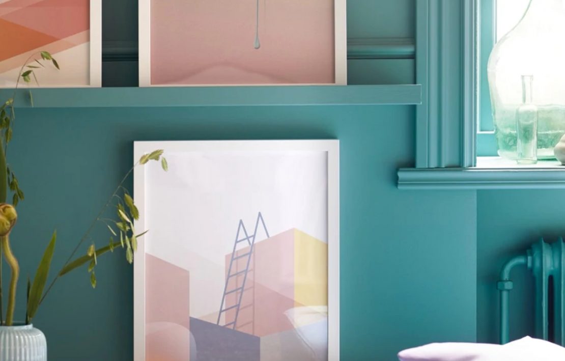
An aesthetic approach of this type is increasingly present in magazines, in furniture catalogs, even in Ikea advertisements: the monochromy invades an entire wall, without being afraid of covering frames, windows, reliefs, moldings and everything it meets. Without generating classical hierarchies and orders, without highlighting spatial rhythms.

Although this aesthetic choice appears as a brand new fashion, it owes its origins to abstract art. It was in 1973 that the artist Claude Rutault sanctioned his “definition / method” where, briefly, each piece of art has its own rules but in order to exist it must extend itself to the context of the wall. Result? Both are painted the same color.

It is difficult – or impossible – to understand whether the first architectural interventions were based on Rutault or not. It is possible that different sensitivities have come to the same conclusion in different ways, or, as often happens, there are ideas that make their way silently, become part of our unconscious, our cultural background, and pop up when we least expect it.
In my opinion, the merit of this aesthetic research is to have allowed a casual attitude towards the existing, the restoration, the reuse. It allows us to dare, where we wouldn’t have allowed ourselves before. It allows us to reuse what we would have previously thrown down. It allows us to create harmony in different ways.

A beautiful example is the renewal of the Prada Foundation by Rem Koolhaas (above in the photo). One of the main volumes, standing since 1910, has been highlighted by a gold coating, which covers every protrusion, without exception.
There are really many projects that use this device and modify it from time to time with new solutions and aesthetic effects. Surely, with the simple “demolition” or substitution they would surely not have obtained the same beauty, the same order, the same surprise.

Right: black pearl @Studio Rolf.fr i.p.w. ZeccArchitecten
Subscribe to the newsletter!

